Bootstrap 3 version is the latest and have brought great goodies that the previous versions were missing.
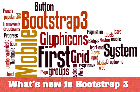
It’s a most popular open source project on github, you will always expect improvements in the new versions. At first, I thought some new features will make their way in current version. But a lot of work has done from ground up.
Here are some noticeable changes.
Mobile First Approach
As mobiles have started to take over the desktop as far as internet access is concerned, more and more of the frameworks started to prioritize the mobile design. As Luke Wroblewski said in his book,
Smartphones were boldly predicted to out-ship the combined
global market of laptop, desktop, and notebook
computers in 2012.– Luke Wroblewski from his book “Mobile First”
But Smartphones achieved that milestone two years earlier. Normally in case of Mobile Screen we lose 80% of the screen of Desktop and so we lose 80% of ads, images, branding, decorative images and even the content itself. We are left with one column layout, either we’ve to go with fixed layout to show rest of the content or stick with mobile layout and prioritize the site content.
So with the help of Bootstrap 3, we start thinking of laying out the website for smaller screen and then we scale up to larger and larger screen size. It would be better if we dig further into this topic by giving you an example.

In above layout simple layout, header is followed by two column layout and the footer. Header and Footer has no problem but a little work is required in the middle section. In general if I wanted to adapt it to smaller screens, one of the two columns must stack on the top. In our case I will achieve such results.

This is our site will look on mobile screen by adding some media queries to you style sheet. Ordering of column is directly proportional to the order in the HTML markup. Here the sidebar which normally contain less important content, appearing before the main section. Which is not a good technique to order the content as far as Mobile First is concerned. For busy mobile users, you must show the important content upfront. What if you want to order the page element differently on mobile screens? With the help of Bootstrap 3 new classes “push”, “pull”, now you can order the elements, the way you want.
One Responsive Grid System
Previously Bootstrap 2 has two grid systems, a responsive and non responsive. This time in Bootstrap 3, we have only one responsive grid system with four grid sizes; large, medium, small and extra small.
Unlike Bootstrap 2, where rows will only behave vertically or horizontally, here we have choice to assign more that one grid size to single row of elements. For example the extra small size of the grid system will keep you website horizontal, no matter what the screen size is.
Long gone that days when IE7 or FF3.6 were supported
Yes, IE7 and FF3.6 are no longer supported. You do have to modify you code a little bit, in order to support IE8 because it has a little support of css3 like media queries and box-sizing which plays major role in responsive layouts.
If don’t worry about Internet Explorer altogether, Bootstrap 3 will work fine on IE9 and later version.
Font Icons (glyphicons) are introduced instead of PNG sprites
Bootstrap 3 comes with free set of glyphicons ( that are other wise available as a paid service) . Sprites Images can’t be scaled up effectively and have crisp quality. Each image requires additional HTTP request and can slow loading time. They are even hard to maintain, when there is need of changing color.
On the other hard “Font Icons“, act just like other fonts. They can be resized on demand without any loss of quality. You can easily apply other css3 decorative typography styles like text shadow, gradient colors and so forth.
Bootstrap 3 has changed column name nomenclature
Bootstrap 2 has a weird way to name to column if you wanted to use grid system. For spanning a div to 2 column wide you have to add “span2” as a class name. Which is clearly a verbose choice, because HTML has its own <span> tags. In the latest version the class name is organized as column followed by grid size and column that going to be spanned like “col-md-8”, “col-xs-6”
2 replies on “Five biggest changes in Bootstrap 3”
good job done buddy. progress ++
Good article Sami.
I am a big fannof bootstrap framework and it makes it very simple and easy to create responsive websites.