The objective is to use checkbox to have effect of group buttons that can be toggled. For example, Button Groups from Bootstrap.
Now they are much easier to implement with CSS :has functional pseudo class.
We’ll start with some mark up, using regular form elements.
    <form>
	<label>
		<input type="checkbox">
		Checkbox 1
	</label>
</form>
Without any styles, our design look like below.

Applying Styles
    input[type=checkbox] {
	appearance: none;
	-webkit-appearance: none;
}

label {
	display: inline-block;
	border: 1px solid currentcolor;
	color: #0d6efd;
	margin-right: 1rem;
	padding: 0.5em;
	border-radius: 0.25rem;
}
We have removed the default styling of checkbox using appearance: none. Than we have added some borders, padding, border-radius to make the label look like buttons resulting in to following output.

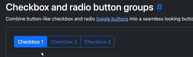
Adding :checked & :hover state
We have reached to the moment of truth.
    label:has(input[type=checkbox]:checked) {
	background: #0d6efd;
	color: #fff;
}

label:has(input[type=checkbox]:not(:checked)):hover {
	opacity: 0.5;
}
We are utilizing the :has to style the label differently, when it has a checkbox that is checked. I know it’s mouthful but if we break it down.
input[type=checkbox]:checkedtargets checkbox that is checked- wrapping with
label:has(...)means the target based on the queries inside the has parenthesis
On line 6 we added hover style, we have used negation pseudo class that prevents certain element from selection. We are interested in adding hover style only when the checkbox isn’t checked. Otherwise it feels really annoying. Here is the result

To cover some accessibility, we will add keyboard focus style,
    label:has(input[type=checkbox]:focus-visible) {
	opacity: 0.5;
}