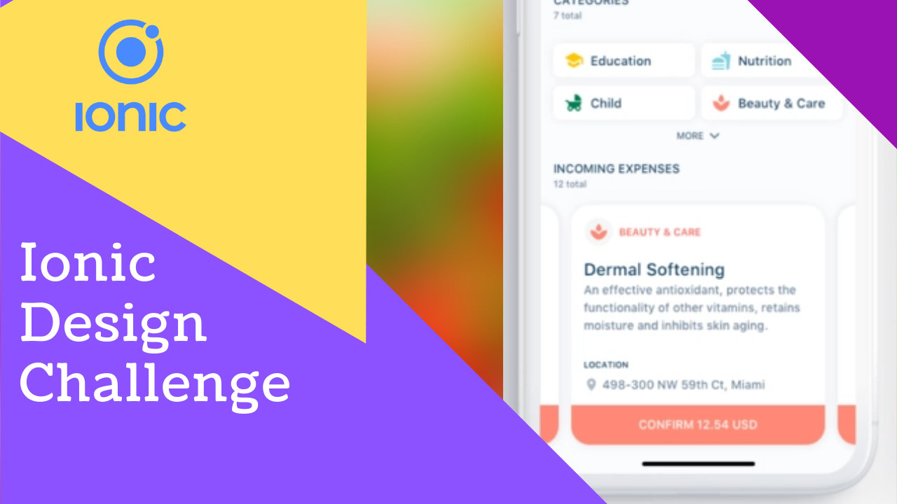
In this article of Ionic design challenge we are looking at this expense app dribbble shot. We are going to convert the lower part of the design (as marked in the screenshot below) using ionic built in components.
If you are more of a video person that I have also attached the video the end of the article
Watch VideoLets create a blank ionic app and serve it.
ionic create incoming-exp blankThat’s how the homepage.html looks like.
<ion-header>
  <ion-toolbar>
    <ion-title>Blank</ion-title>
  </ion-toolbar>
</ion-header>

<ion-content class="ion-padding">

</ion-content>
Let’s modify it base on our needs.
<ion-content class="ion-padding">
  <header>
    <h4 class="ion-text-uppercase" style="padding-bottom: 0;">
      Incoming Expenses
    </h4>
    <ion-label>12 total</ion-label>
  </header>
</ion-content>
I have removed the toolbar and added some elements to ion-content. Here how it looks.
Related Article.
Here is how to effectively host Ionic PWA to Heroku
Adding Ionic Slides
The very first Ionic UI component we gonna use is Ion-Slides. We will add some basic ionic slides. The pagination and other configuration can be added by [Page] and [options] properties. We will not use them for the sake of brevity.
<ion-content class="ion-padding">
  <header>
    ...
  </header>

  <ion-slides>
    <ion-slide>
      <h1>Slide 1</h1>
    </ion-slide>
    <ion-slide>
      <h1>Slide 2</h1>
    </ion-slide>
    <ion-slide>
      <h1>Slide 3</h1>
    </ion-slide>
  </ion-slides>
</ion-content>
Adding Ionic Cards
We have some very generic content in the ion-slides. Let’s use Ion-Card to make them more meaningful.
<ion-slides>
    <ion-slide *ngFor="let slide of expenses">
      <ion-card>
        <ion-card-header>
          <ion-card-title>Card Title</ion-card-title>
        </ion-card-header>

        <ion-card-content>
          Keep close to Nature's heart... and break clear away, once in awhile,
          and climb a mountain or spend a week in the woods. Wash your spirit
          clean.
        </ion-card-content>

        <footer>
          <ion-button expand="full" class="ion-no-margin">Full Button</ion-button>
        </footer>
      </ion-card>
    </ion-slide>
  </ion-slides>
One line two I just used a dummy array along with angular *ngFor to show dummy slides. After applying above changes the result becomes;
The content is center aligned. Lets fix it, we also need to add an image to make the card prominent.
<ion-slide *ngFor="let slide of expenses">
  <ion-card class="ion-text-start" style="border-radius: 15px">
    <img src="http://lorempixel.com/400/200/technics/9/" alt="">
    <ion-card-header>
    <!-- ... -->
</ion-slide>
We have used class ion-text-start, we could also use ion-text-left but later one is less semantice. ion-text-start uses Logical Properties which make sense as far as differting writing modes like right to left is concerned. The border radius bumped up to 15px from default 4px.
On line 3 Lorempixel is used which is great resource for placeholder images.

Adding Ion Button
For final touching lets add one full size button to end of the card. The Ionic Card doesn’t come with footer element. But no problem HTML5 footer element for the win, which works perfectly in our case. Our final code listing becomes;
<ion-content class="ion-padding">
  <header>
    <h4 class="ion-text-uppercase" style="padding-bottom: 0;">
      Incoming Expenses
    </h4>
    <ion-label>12 total</ion-label>
  </header>

  <ion-slides>
    <ion-slide *ngFor="let slide of expenses">
      <ion-card class="ion-text-start" style="border-radius: 15px">
        <img src="http://lorempixel.com/400/200/technics/9/" alt="" />
        <ion-card-header>
          <ion-card-title>Card Title</ion-card-title>
        </ion-card-header>

        <ion-card-content>
          Keep close to Nature's heart... and break clear away, once in awhile,
          and climb a mountain or spend a week in the woods. Wash your spirit
          clean.
        </ion-card-content>

        <footer>
          <ion-button expand="full" class="ion-no-margin"
            >Full Button</ion-button
          >
        </footer>
      </ion-card>
    </ion-slide>
  </ion-slides>
</ion-content>
As we can see the footer is the latest changes and the final result becomes
2 replies on “Ionic UI – Design Challenge – Incoming Expenses [Screencast]”
[…] Previously I have use lorempixel for placeholder but that does not work for some reason. I have borrowed a cat from placekitten. […]
[…] If you are interested in other awesome Ionic UI components than I recently wrote about a UI Design Challenge […]